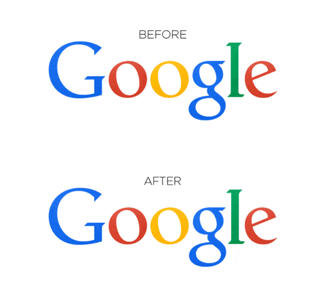
You might not have noticed but there is a subtle tweak in Google’s logo. The change that happened over the weekend is so minute that you like all others might have missed it. Reddit was the first to spot the change.
The “g” and “l” in the logo have been moved ever so slightly to look better. Google has made this change in the logo because it was off by a pixel, and now it looks better.
[useful_banner_manager banners=25 count=1]
Digital Marketing Training Program
For working professionals & entrepreneurs
Learn how to market a business online just like experts & agencies do it. Learn from real practitioners not just trainers.
Word From Our Trainees
At Delhi School Of Internet Marketing we have trained professionals and business owners from various industries and helped them to successfully market their brand online. Here is what they have to say about their training experienceCheck All Feedback
Important Links
Categories
Popular Articles


